Monday, 2 September 2013

CLUB TO CATWALK

How do you make a lady of a certain age go all misty eyed with nostalgia about her youth? Take her to see 'Club To Catwalk' at the Victoria and Albert museum.
Take her back to a time when the North/South divide was about what side of the river you came from and reunite her with the excitement of tripping out into that severe 80's London night air that hit the back of your throat like a steel blade, in one's best homemade schmutter, to sample the decadent hedonistic delights offered up by a whole myriad of the eclectic, eccentric demimonde.
Remind her of when she was a bit of Wag girl, never having to queue, but would waltz right up to the front where Winston would wave her right through to ascend to that tiny first floor room in Wardour Street. Here all the boys, looking like Montgomery Clift or Harry Belafonte in their Bass Wejuns and red-tags with the red selvedge, eyed up girls with scarlet lips and giant hoop earings.It would get so packed on a Friday night that you could hardly move and she would stick her bottle of Pils down her cleavage for safe keeping and dance the night away to 'Baby Brother'
It was such a creative colourful atmosphere even though it was juxtaposed against the harshness of Thatcher's Britain, a real threat of impending Armageddon and the emergence of a new killer disease called AIDS [we really did think we were all going to die- and in the case of the latter a lot of the very talented tragically did]. 
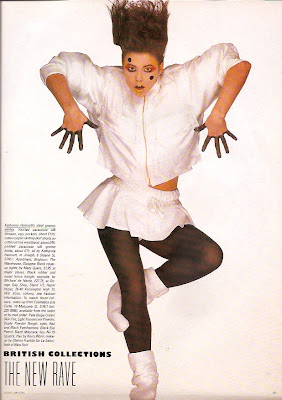
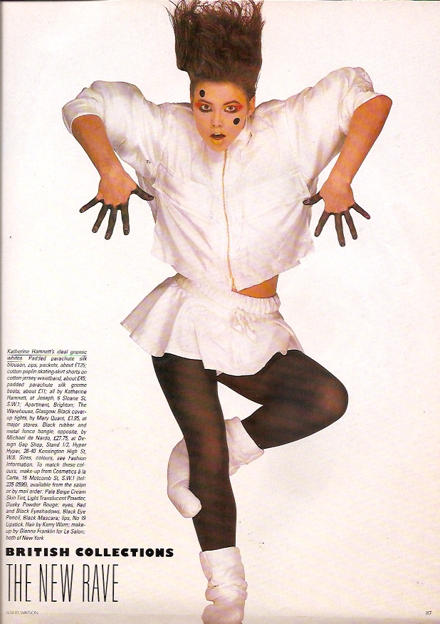
The early 80's were especially bright when it came to pattern and colours. Prints popped and fabrics stretched as Lycra was added to everything. Young British designers who had cut their teeth on Punk, rejected it's nihilism but kept the peacock strut, and a diverse group burst onto the catwalks as shown from this Vogue shoot from August 84.


Helen Robinson for PX


Liza Bruce

Katherine Hamnett


Katherine Hamnett

Annie Lepaz

Annie Sherburne

Body Map

Body Map

It's probably hard to understand the impact this had from our distance but you have to remember that Vogue, at this point, had turned into little more than an up-market Women's Own. Recipes and knitting patterns filled it's pages and the stylist, an enigmatic exotic creature, had only recently come into infancy, and hadn't yet evolved into the Dr Frankenstein of Fashion that she/he is today, so to see looks that you'd seen adorning London's nightlife fauna in a mainstream mag was quite something.


Above, 3 Jessica Light print designs circa 1984 which were mono-printed onto cotton jersey for a fashion show.


Above,
Our Antibes trims have a bit of an early 80's zingy vibe about them

DAVID BOWIE IS...
now over. One of the most successful exhibitions ever is now on a world tour so if it comes to a town near you don't miss.


If you were one of the thousands who made it to the V and A and now feeling a bit of Ziggy withdrawal why not add a bit of Aladdin Sane luxe glam to your home with our Potsdam trims as seen below


Sunday, 18 August 2013

CREATIVE HOOK UP

So there you are having created the most amazing piece of design/craft/decorative art and the only person who knows it exists is you. How do you launch it to the big wide world? Well why don't you come along to Creative Hook Up on 1st September where I'll be speaking about how to market and PR a small creative business. Drawing on all my experience from devising and running Jessica Light Trims And Tassels I'll talk about how I go about getting attention for what I do from a wider audience other than the cat.


Creative Hook Up, the brainchild of Laura Austin, is a networking event with a difference and best described in her own words.

"Geared towards creative people not strictly “creative” by job title but also by nature, the Creative Hook Up event brings people together who have different expertise, skills, and ideas, and who could gain inspiration by talking to (and hearing from) like-minded (or un-like-minded) people from a myriad of backgrounds. A friendly place to make new connections, look for advice, gain insights, learn, feel inspired, energised and better connected with the world. "
For more information http://creativehookup.tumblr.com


Monday, 22 July 2013

IN FINE STYLE


The above portrait of Princess Elizabeth, aged 13, by William Scrots, is one of my all time favourite paintings. I first saw it, in black and white, in a book about Queen Elizabeth 1 I was given when I was six. A pale face with a determined mouth showed not a child but someone whose young life had already witnessed so much [the execution of her mother for starters].It began a life-long fascination with all things Tudor. So to my great joy there seems to be an abundance of exhibitions about this period this year. First up was 'Treasures Of The Royal Courts' at The Victoria and Albert, now 'In Fine Style' at The Queen's Gallery, and later in the year 'Elizabeth 1 and Her People' at The National Portrait Gallery. I feel I've died and gone to Hampton Court.
'In Fine Style, The Art of Tudor and Stuart Fashion' demonstrates
in extraordinary detail through portraiture and rare examples of clothing from the period- a Stuart linen lace collar so delicate it would turn to air if handled, tiny ornate bodices that are slashed, padded, and quilted to elegant embroidered and trimmed kid gloves- the luxuriant decorative richness of the textiles, clothing and accessories that adorned the elite. This exhibition illustrates not only the extreme skill of the documenters, Holbein, Van Dyke, and Hilliard, but that of the weavers, embroiderers, seamstresses, and jewellers who produced these wares. The opulence of 16-17th century fashion wasn't just to cut a dashing figure but conveyed important messages about the wearers place in society.


Above, details of passementerie in some of the paintings on show at 'In Fine Style'

Those Tudors loved a bit of passementerie. It was everywhere, and anyone who was anyone would show their wealth and status by adorning not only their homes with it, but also their persons. A tassel was the Rolex of it's day. 
If I had set Jessica Light Trims and Tassels up in the 1500's instead of today I'd be snowed under with work. No urban croft but some fancy manor along the Thames where I'd be getting it on with Sir Francis Drake and ordering my minions about a la Steve Zissou [The Life Aquatic] "Hey you, intern! Get me a Campari!". Although I don't think they had Campari in the 16th century, or for that matter interns. So it would have been more along the lines of "Hey you serf! Get me a mead and be back by sundown or I shall behead thee!"
One can dream and the nearest I can get is to infuse my work with a touch of Tudor. The passementerie weaving techniques I was very lucky to be trained in [which differ greatly to other forms of weaving, both in a practical and technical sense] all hail from the 15/16th centuries, and I've always been drawn to the trim structures of this period.
When it came to our new diffusion range I pulled some of these influences out of my magician's hat along with an idiosyncratic melange of directions, materials and colours.

Harwick Diffusion range available from Jessica Light Shop from mid-August.

I will now come clean and admit I've always fancied donning a farthingale [it was on my 7th birthday list] although it would be rather cumbersome trying to get through the turnstiles at Hoxton station, but I'm often reminded of Tudor style in a diverse way from other fashion eras.
Whilst being surrounded by the hopelessly glamorous photographs of Erwin Blumenfeld at Somerset House recently I felt there was a touch of the Holbeins about some of the images. Haughty ladies gazed out at you from their regal poses in well tailored be-hatted outfits not too dissimilar to Hans' wonderful chalk drawings of Tudor nobility.


Above, 3 of Blumenfeld's lofty ladies.
Below, Their predecessors by Hans Holbein


You can even find a little of that early Elizabethan elegance in the 1970's [I kid thee not] in the delicious designs by British couturier John Bates as illustrated by the images below.


P.S. If you want to know what inspires Jessica's work see her post for the Horniman Museum blog about how their African Worlds gallery helped form her Bexley collection, and have a look at the range. http://www.horniman.ac.uk/get_involved/blog/horniman-inspiration-jessica-light http://jessicalight.blogspot.co.uk/p/bexley.html

Thursday, 4 April 2013

THE LIGHT SHOW

It seems entirely fitting that as Spring slowly draws the blind up on winter and a swathe of timid sunlight paints a pale stripe down the wall, the first major exhibitions of the year should also put the spotlight on that most essential of elements, light.


Our giant light reflective tassel. I hide in it when I'm feeling melancholy.

MAN RAY PORTRAITS

Man Ray, aka 'The Master Of Light' is renown as one of the most experimental and creative artists who used the medium of photography. This self-taught American, born in 1890, is mainly associated with the Surrealist and Dada movements of the early 20th century. His meeting and subsequent friendship of Dada French Artist, Marcel Duchamp at an Artists Colony in New Jersey resulted in him moving to Paris in 1921 and mingling with the Avant Guarde that would later become his subjects.
Winding your way through The National Portrait Gallery's 'Man Ray Portraits' your path is lit by 20th century luminaries. The intense dark eyes of Dali, Picasso and Cocteau follow your every response and The Beautiful, The Powerful and The Downright Bizarre are surrounded by halos of light, silver linings or placed in surreal settings with intent to fascinate your attention. Ray's manipulation of light and shadow to cause solarization is a signature look of his work.


Above, two of Man Ray's portraits.
Left, The beautiful Lee Millar, 1929, and Man Ray's then lover, who went on to be a highly acclaimed fine art, and later a war photographer, in her own right, and was one of the first people into Dachau concentration camp when it was liberated in 1945.
Right,Genica Athanasiou 1933. Man Ray's first colour portrait. 

Viewing these photographs and others from recent exhibitions- Beaton at the Imperial War Museum, Storyteller [Tim Walker] and the current Landmark [look out for Pivot Irrigation by Edward Burtynsky -an extraordinary beautiful image of a landscape the everyday would consider barren] at Somerset House, made me think about the photographers connection to his/her craft. It's easy to forget, in this digital age where the kit becomes more sophisticated by the minute and we can process/edit/delete our own images at the touch of a button, the excitement of being locked in a darkroom [especially if it's with the object of your desire], inhaling those heady toner fumes and watching, through a number of intense processes, an image slowly materializing before your eyes.
The ongoing debate as to whether photographic images constitute Art [Man Ray often felt they didn't]now has another front, the heated battle between film v digital. Both sides have their champions and the question- Which do you prefer?- is one I've posed to many a photographer. But, as one photographer put it- If you don't have the creative eye for composition in the first place neither format matters- 
Now that that humbling experience of getting your holiday snaps back from Boots, to find out that, from a roll of film of 36 pictures, 35 are out of focus, have red eye or are of your feet, is no longer with us, it's good to see so many major galleries showing collections from the magic box that is a camera to remind us that photography isn't just a means to record people, places, events etc but a creative outlet to inspire, provoke and question. 

THE LIGHT SHOW

'The Light Show' at The Hayward Gallery on the South Bank is a collection of exhibits that explore artists response to light as a material. You are greeted by a cascading waterfall of sequenced flashes of light like a glittering sparkler shower from the majestic 'Cylinder' by Leo Villareal. A good opener for a show that has drama and power throughout. 


'Cylinder' 2012, Leo Villareal.

The exhibition continues with  instillations that play tricks with your senses, sometimes disorientating, sometimes disturbing, sometimes calming, at all times engaging and interactive. Neon, fibreoptic, halogen, and LED are all used to create light, dark, shadow and colour. One minute you're standing within a smokey single beam of light in a dense dark room, the next sent into a claustrophobic eternity of surrounding repetitious lights and mirror when you step into  Ivan Navarro's Tardis-like phone-box, 'Reality Show', finally ending with the overwhelming nausea inducing effects of strobes set on water fountains.  

'Magic Hour'[2004], David Batchelor

Painting with coloured light, Carlos Cruz-Diez's 'Chromosaturation' [1965-2013]

Inspiring? Very. Especially as it turns ones thoughts to the visual effects of light on perception of colour and space. It also triggered comparisons and usage to other disciplines. For example 'Chromosaturation' reminded me of the Modernist Mexican architect Louis Barragan whose use of colour was integral to his buildings, but also relied on the Mexican tropical light to bring out their colourful vibrancy.


Above, 3 examples of Barragan's work.

Bright and blocked colour has been prevalent in interiors and products for sometime and a trend as popular as this takes a while to wane, but I do think that light is going to play a big part over the next couple of seasons on how we look and perceive colour. Brights will become more diluted, bleached, and reflective or deeper and intense as if someone turned the lights out on a room of colour.


Our new Taiwan tieback colourway using deep rich colour.
Available from Jessica Light Shop